

Asset Class Returns - 6/30/2024
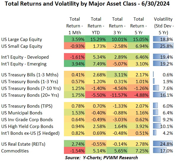
Risky asset classes had mixed returns in June. US Large Cap equities were +3.6% but Small Caps actually fell -0.9% for the month. The YTD dispersion is quite wide now, at +15.3% vs. +1.7% respectively. US REITS were also up in June at +2.7% but -0.6% YTD (based on DJ REIT Index). International equities were also mixed. Developed markets were down -1.6% on back of elections in Europe while Emerging markets were up a whopping +3.9%. YTD returns are much closer for these markets as seen above. Commodities was the other asset class that was down -1.5% for the month but still holding a solid 5.1% YTD return. Energy was the leading subsector (unlike Energy equities) while Ags lagged. All bond asset classes had positive returns for June with the usual return differentials in Treasuries reflecting different durations for each security. Looking at the non-Treasury section below that, the slightly lower – though still positive returns – indicate a slight widening in credit spreads except for Munis.
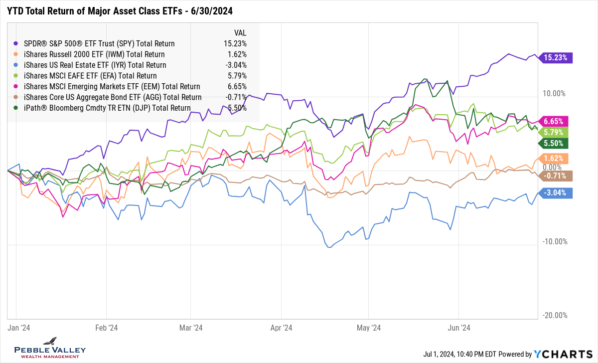
The graph below shows YTD total returns of major asset class ETFs. You can see the mixed results for June looking at the right side of the graph. The US equities stick out as the outlier. The dark green line representing Commodities may get lost in all the lines but saw a slow grind lower as it continued the pullback started in late May. The ETF US REIT (ticker IYR) continues to lag all other major asset classes. I continue to capture US bonds with the single “AGG” ETF but there are a few subsectors that show different returns as noted by the YTD table at the top of this blog post.
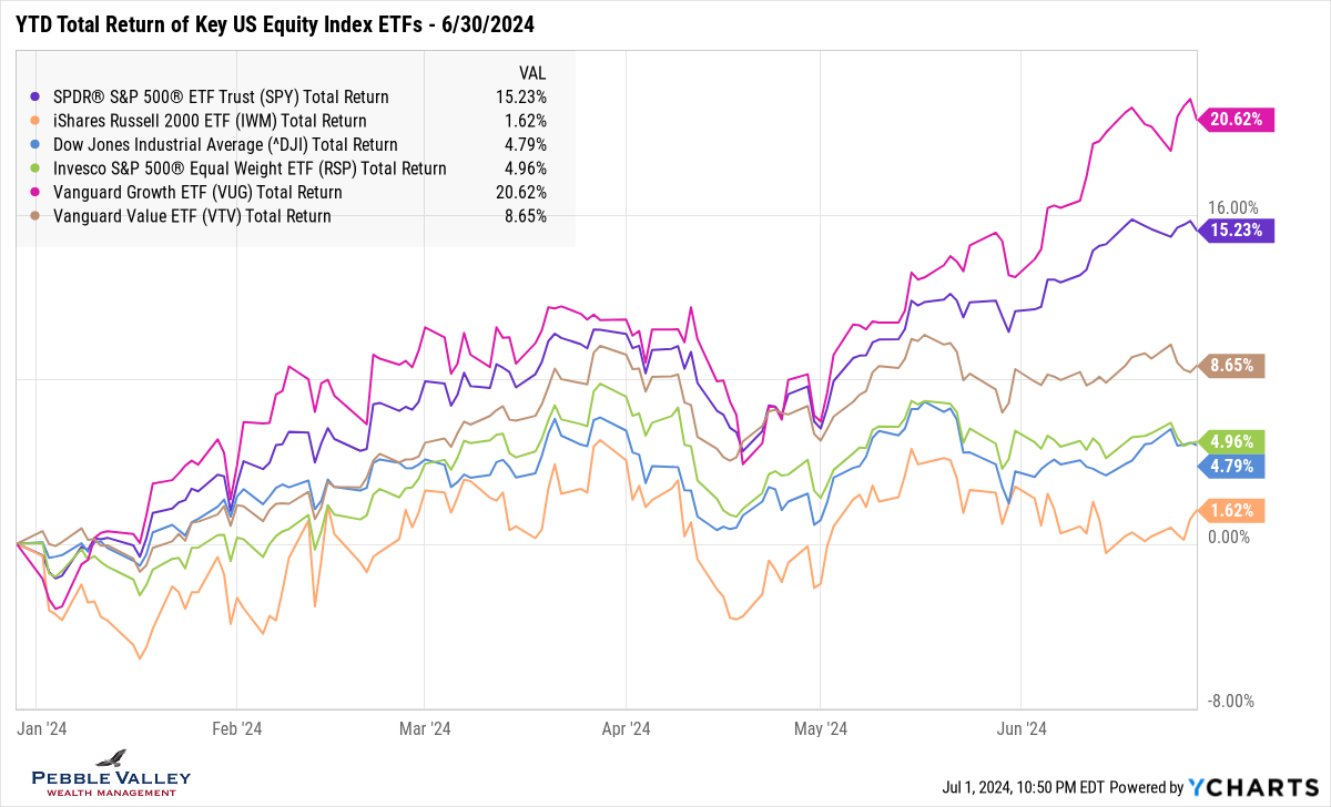
Once again this month I am including a graph that captures the large dispersion between Growth vs. Value and how the more common indices you may be familiar with compare. The last time we saw this wide dispersion was about a year ago when it was an even wider 30+% before pulling back the following few months.
The top 3 lines capture the US equity market in purple (S&P500) along with Growth in magenta and Value in brown. Then notice the green line which is the same stocks as the S&P500 but is equal rather than market-value weighted. This highlights the dominance of the top 10 names making up over 30% of the S&P500 currently. I then include the DJIA in blue and Small Caps in orange to highlight the wide range of returns – all within the broad “US Equity” category, again highlighting the recent dominance of a narrow slice of the market.
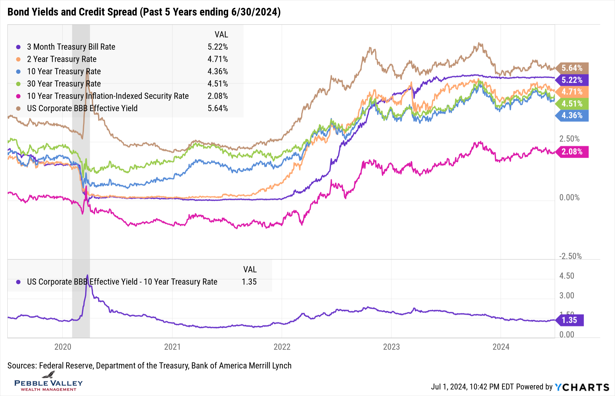
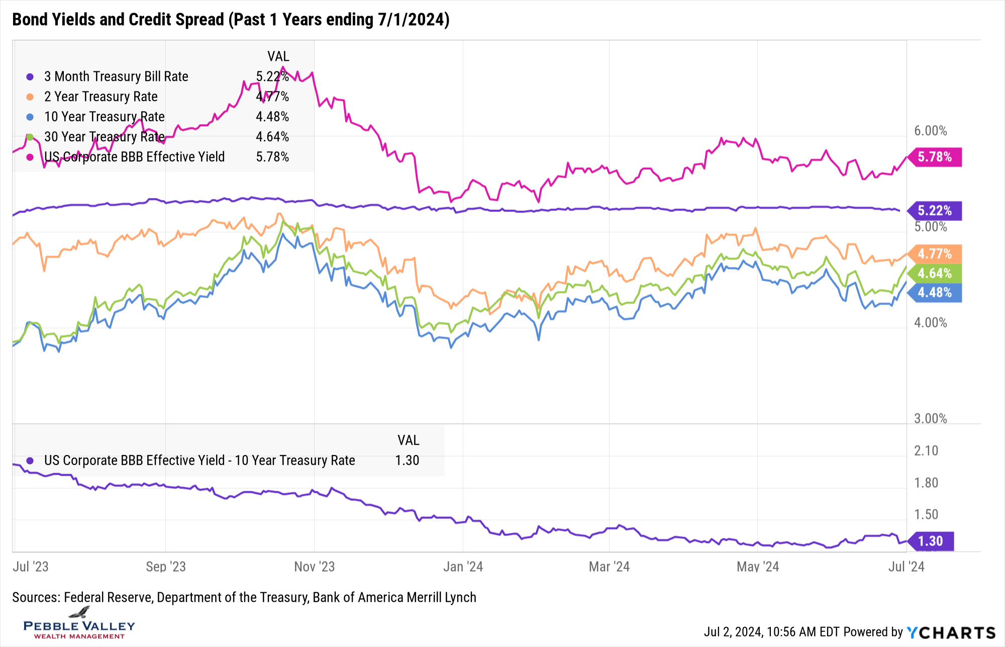
I am including the same Treasury and BBB-Rated corporate yield graph over the past 5 years for context. However, given the relatively large swings in bond yields lately (yes, large for bond market) I also include a 1-Year graph and excluded TIPS for more granularity. You may recall the rapid rise in rates late last summer after the Treasury announced their longer and larger debt refinancing needs. The long-end of the curve – 10- and 30-years – hit the 5.0% area just before Halloween, before ripping back lower in yield based on perceived dovish Fed activity. Since the beginning of 2024 rates have slowly drifted back up (except TBills remaining steady) as the 6+ implied Fed rate cuts were priced out. Over the last few days the long-end began rising again on the back of concerns of the Federal deficit and continued debt issuance to cover the bills. See my special topic below for more. The 2-year part of the curve is more muted as the market expects the Fed to begin easing, if not later this year than early in 2025.
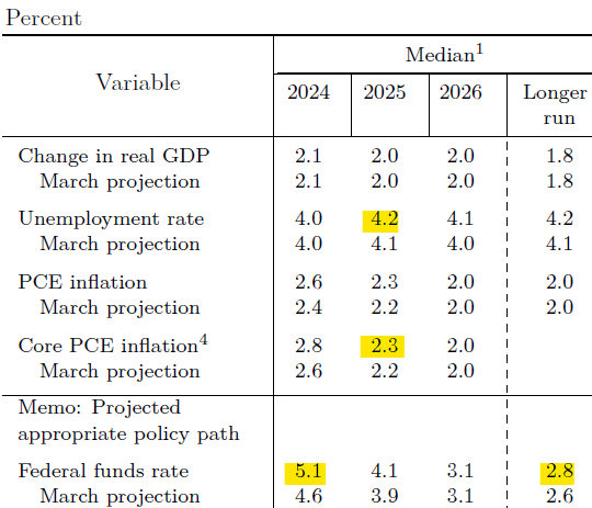
The last FOMC meeting was June 12th and included the Fed’s latest Summary of Economic Projections (released 4 x’s per year). There was a significant shift in rate views relative to the last projection in March. Not only did the number of rate cuts expected for 2024 fall from three to one, but surprising to me was the “longer run” projection went up. They also projected higher inflation and unemployment relative to March – still quite tame but in the wrong direction (see Table below – Source: Federal Reserve). The CME Fedwatch Tool from the CME Group continues to show about an even split by year-end for either two rate cuts vs. one or no rate cuts.
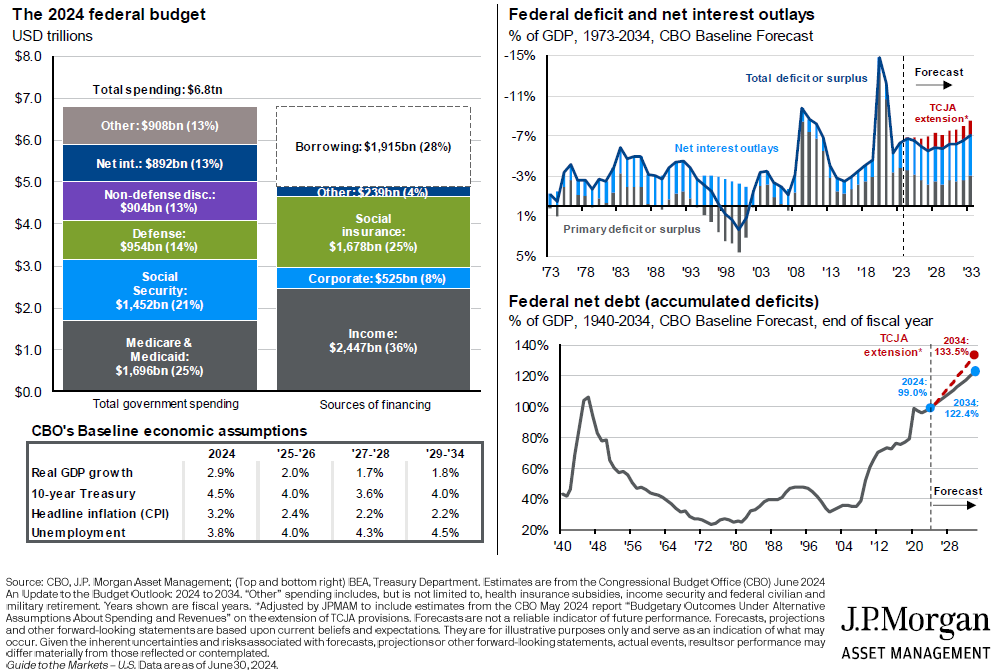
My special topic this month is the a summary of US Gov’t finances. The summary below is from the JPM Guide to Markets June 30, 2024 and highlights some very important numbers all taxpayers (and bondholders!) should be aware of. A few things that jump out at me:
- Know the difference between deficit and debt
- Deficit is shortfall in annual budget; made up by borrowing more debt
- Debt is total amount of public debt borrowed which is $34.8 Trillion and growing
- Social Security and Medicare make up 46% of annual spending
- Net interest expense alone makes up 13% of annual spending, soon to exceed defense spending as a %
- Debt as % of GDP is about to exceed 100% and surpass WWII levels
- Houston, we have a problem!
Enjoy the 4th celebrations. I made good progress on my summer ice cream quota this past month!
Posted by Kirk, a fee-only financial advisor who looks at your complete financial picture through the lens of a multi-disciplined, credentialed professional. www.pvwealthmgt.com